
Dream
I wanted to use this blog to document some of the processes that I deal with in enamelling. I have often set up the camera to take shots of the pieces as they go along. The purpose of this is to let people in to some of the mysteries of making. It is never easy to communicate a complicated process like enamelling, but I hope I can elucidate it a little.
To many people processes are very mysterious. This is to some extent a function of the industrial age, where making suddenly was taken out of the home and away from the public crossroad (where blacksmiths used to wield their magic) and closed it behind factory doors. In the past people would have been exposed on a daily basis to the making of even everyday things. But everything is different now.
Process is something that we artists have a mixed relationship with – especially artists like myself who work with a material that is demanding.
I had an interesting experience recently designing a special order that I thought I would share with you.
Champleve as a technique has many limitations. I have to be careful how deep I etch, what I use to counter-enamel, what colours I put next to each other, how thick the lines are, how the lines curve etc. But I have been using this technique for many years, and have achieved a certain comfort level with it. So when a customer asked me to design a piece based on a dream she had had, I dropped right into my usual design mode.
There were three basic elements to the dream – which were in themselves fairly abstract, and the client wanted to keep it simple. There had been a deep red bowl against a dark blue ground with e green cross emerging from the bowl. Simple – right? But after working and reworking these elements I was still unsatisfied.


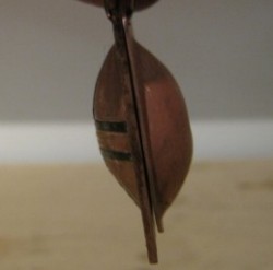
I just couldn’t seem to give the shapes life. I thought long and hard about how I might be able to use shading to create more of a sense of the bowl, and then all of a sudden the penny dropped. With all the limitations that champleve has – it does NOT have to be flat! Why don’t I make an actual bowl? So I did a bit of a mock up with some copper scrap I had: this is two separate pieces.


I had been fooled into thinking that champleve needed to be flat simply because I hadn’t needed it to be anything else until now. Finally the piece started to feel like it had some power. It had been over a year since I took my silversmithing class – but I thought I could manage what I wanted with the simple tools I had in the studio. At first I thought of riveting the pieces together, but later the KISS principle seemed a better plan (KISS: Keep It Simple Stupid) so I decided just to hang both pieces from the same holes


You can see that the hammering process caused the sides to pull in at the centre, so I deliberately made it larger than I needed so that I could trim the edges straight.
I waited until after etching to cut around the cross


I spent a fair amount of time experimenting with colour. Red is a very difficult colour to control (apparently this is true in glass blowing as well). There are also certain tension problems I had to deal with – but layering the red over a dark brown seemed to produce the results I was looking for, both technically and aesthetically.
I was particularly stumped by the green, as all the shades I created seemed to make the piece seem garish. I talked to the client again, and she described the green she had in mind as the greenish grey of weathered wood – and suddenly everything fell into place.

The finished piece is only about 1 1/4″ square. I am now thinking of designing a line of pieces with a bowl in the back, possibly based on runes. It’s has opened up a whole new range of ideas; that’s the exciting thing about process!
